Redesigning GitLab's navigation
about.gitlab.com
Redesigning GitLab's navigation
1–10 of 85 posts
Re: Redesigning GitLab's navigation
#2You can tell someone is copying someone else's work when they copy the bad stuff. The search box on GitHub and now GitLab wastes space with "This repository" spelled out. It's also odd that you get more space to type when you're not searching inside of a repo, and that backspace is how you switch to a more general search. Pity. I thought that GitLab had learned their lesson and stopped copying GitHub.
Aside from that, it sounds like a well thought out feature, and it's good that they're redoing it instead of just changing it bit by bit.
Re: Redesigning GitLab's navigation
#3You can tell someone is copying someone else's work when they copy the bad stuff. The search box on GitHub and now GitLab wastes space with "This repository" spelled out. It's also odd that you get more space to type when you're not searching inside of a repo, and that backspace is how you switch to a more general search. Pity. I thought that GitLab had learned their lesson and stopped copying GitHub. Aside from that…
Even if they have taken UI cues from elsewhere, I don't think this is a bad one. The search box is in the global context section and it's important to signal that it's going to behave in a non-global way. Having a flexible width text input or making it expand over the 'This Repository' hint (or whatever other context hint is there at the time) would be an easy solve for it being too small.
Re: Redesigning GitLab's navigation
#4Heads up for the Gitlab people here-- The user preferences link under try it yourself 404s for me, both when logged in and out. Excited to try out these changes though!
Edit: Appears to be the same path but with `about` subdomain
Re: Redesigning GitLab's navigation
#5Heads up for the Gitlab people here-- The user preferences link under try it yourself 404s for me, both when logged in and out. Excited to try out these changes though! Edit: Appears to be the same path but with `about` subdomain
Thanks for the heads up, we are investigating this now.
Re: Redesigning GitLab's navigation
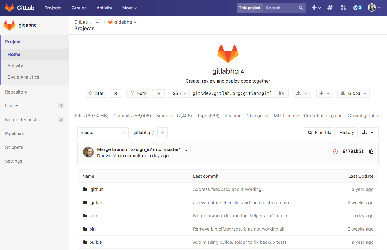
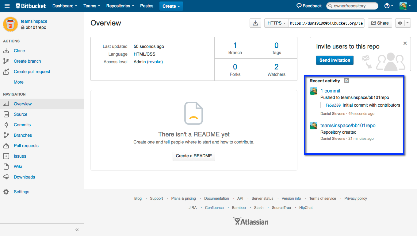
#6Bloody hell, this looks like Bitbucket, but purple.
Compare:
Gitlab final prototype: https://about.gitlab.com/images/blogimages/redesigning-gitla...
Bitbucket server: https://confluence.atlassian.com/bitbucket/files/304578655/5...
The resemblance is uncanny.
Re: Redesigning GitLab's navigation
#7You can tell someone is copying someone else's work when they copy the bad stuff. The search box on GitHub and now GitLab wastes space with "This repository" spelled out. It's also odd that you get more space to type when you're not searching inside of a repo, and that backspace is how you switch to a more general search. Pity. I thought that GitLab had learned their lesson and stopped copying GitHub. Aside from that…
>You can tell someone is copying someone else's work when they copy the bad stuff.
Once people learn a UI, they really hate deviations from it. It doesn't matter whether githubs UI is good, and it doesn't matter whether gitlab's UI is better. People are used to github, and the peanut gallery will bitch if things are different. The trick for gitlab will be in finding the UI differences that give the maximum improvement for the minimum change. That's what will give the desired sensation of "clearly better than github". Overdo it, and it'll feel alien and weird.
Re: Redesigning GitLab's navigation
#8Bloody hell, this looks like Bitbucket, but purple. Compare: Gitlab final prototype: https://about.gitlab.com/images/blogimages/redesigning-gitla... Bitbucket server: https://confluence.atlassian.com/bitbucket/files/304578655/5... The resemblance is uncanny.
It has a left navigation bar and search on top, that seems to be about it for the similarities. Notably the main content is totally different.
Re: Redesigning GitLab's navigation
#9Something I found missing is the missing shortcut to easily go the page of "merged request assigned to me" (which is the link 'merge request' in the global menu) as it's the single page I visit the most every day at work, to see across all projects , the merge requests that i need to check.
Re: Redesigning GitLab's navigation
#10Heads up for the Gitlab people here-- The user preferences link under try it yourself 404s for me, both when logged in and out. Excited to try out these changes though! Edit: Appears to be the same path but with `about` subdomain
Thanks for the heads up, we are investigating this now.
GitLab should make it so that anyone who reaches a 4xx or 5xx error page should be able to trivially (as in one click from the error page) file a bug about it on the GitLab tracker. Make sure to pre-populate the template with URL, status code, and referer.