Live data from Hacker News

Ask HN: Help Me Understand Yosemite's Lock Screen Apple Icon?

news.ycombinator.com

1–8 of 8 posts

Ask HN: Help Me Understand Yosemite's Lock Screen Apple Icon?

#1
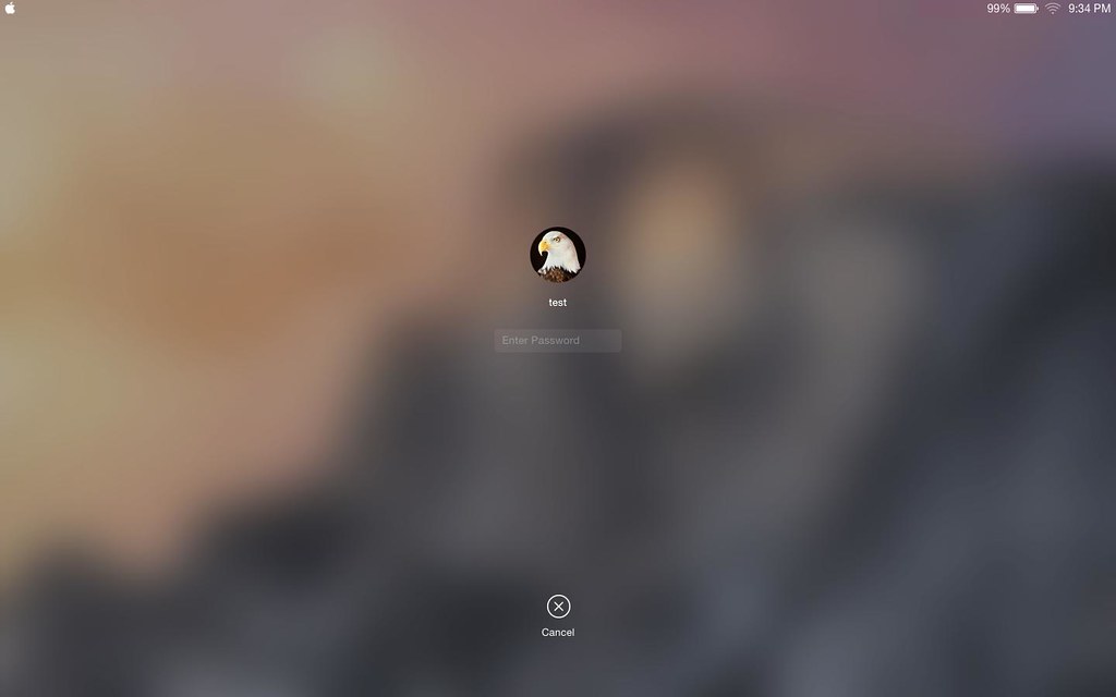
Why do you think Apple put their logo as a functionless icon in the top-left corner of the lock screen?

My first impression is that it adds unnecessary clutter to the interface, and is confusing to users because it is functionless in the lock screen (as opposed to being a menu item when the OS is unlocked).

Are there any designers out there who can help me understand the decision? Given the care Apple puts into their designs, I assume that I am missing something. :)

Thanks! ~ Mike

PS: Here's a link I found on google so you can see what I'm talking about: https://farm4.staticflickr.com/3851/14147481657_389c093f30_b.jpg
Re: Ask HN: Help Me Understand Yosemite's Lock Screen Apple Icon?

#2
Here's a screenshot: https://farm4.staticflickr.com/3851/14147481657_389c093f30_b...

Looks like nothing but branding to me, but I guess you could argue it provides some sort of consistency with the status bar. It might also be preparation for a more interactive lock-screen similar to what iOS 8 offers (http://9to5mac.files.wordpress.com/2014/06/img_00071.png).

Re: Ask HN: Help Me Understand Yosemite's Lock Screen Apple Icon?

#4

Here's a screenshot: https://farm4.staticflickr.com/3851/14147481657_389c093f30_b... Looks like nothing but branding to me, but I guess you could argue it provides some sort of consistency with the status bar. It might also be preparation for a more interactive lock-screen similar to what iOS 8 offers ( http://9to5mac.files.wordpress.com/2014/06/img_00071.png ).

Agreed. I think the intent is to provide menubar consistency. You'll notice this in the FileVault pre-boot login prompt as well, IIRC.

Re: Ask HN: Help Me Understand Yosemite's Lock Screen Apple Icon?

#5

Here's a screenshot: https://farm4.staticflickr.com/3851/14147481657_389c093f30_b... Looks like nothing but branding to me, but I guess you could argue it provides some sort of consistency with the status bar. It might also be preparation for a more interactive lock-screen similar to what iOS 8 offers ( http://9to5mac.files.wordpress.com/2014/06/img_00071.png ).

The thing that bothers me about this is that the Apple logo is not positioned exactly in the same way as it is on the menu bar (it is shifted a bit on the left).

Re: Ask HN: Help Me Understand Yosemite's Lock Screen Apple Icon?

#7
post #6

I've got multiple machines in my work environment - Linux and Apple boxes. I don't often do it, but sometimes I forget what I'm using when I unlock - maybe they put an Apple there to brand the screenlock so that there wouldn't be such confusion?

Interesting - hadn't thought of that!

Re: Ask HN: Help Me Understand Yosemite's Lock Screen Apple Icon?

#8
post #5

Here's a screenshot: https://farm4.staticflickr.com/3851/14147481657_389c093f30_b... Looks like nothing but branding to me, but I guess you could argue it provides some sort of consistency with the status bar. It might also be preparation for a more interactive lock-screen similar to what iOS 8 offers ( http://9to5mac.files.wordpress.com/2014/06/img_00071.png ).

The thing that bothers me about this is that the Apple logo is not positioned exactly in the same way as it is on the menu bar (it is shifted a bit on the left).

True - weird, huh?

I wonder if in the coming months they'll fix it (or get rid of it).