Depends on why I am selecting a typeface.
Ask HN: What's your favourite typeface?
11–19 of 19 posts
Re: Ask HN: What's your favourite typeface?
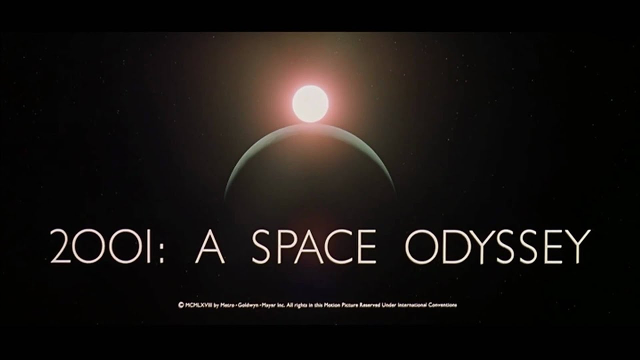
#12Fun typeface fact: Stanley Kubrick's favourite was Futura Extra Bold, it was used on the posters for Eyes Wide Shut and 2001
Source: (http://www.theguardian.com/film/2004/mar/27/features.weekend)
The Nike logo is also from the Futura family (https://www.quora.com/What-font-is-used-for-the-Nike-logo)
Re: Ask HN: What's your favourite typeface?
#13Chicago.
For fun, for nostalgia, for distinctiveness, for boldness, for my heart and my soul.
https://en.wikipedia.org/wiki/Chicago_%28typeface%29
Susan Kare, its prolific designer:
Re: Ask HN: What's your favourite typeface?
#14Adobe Garamond [0] is really nice to look at, I think, especially for long passages of text.
With Akzidenz-Grotesk [1] as a runner-up (and for headlines etc.). Font fun fact: This was actually the font Massimo Vignelli originally used on the NYC subway system, before the MTA changed it to Helvetica (which is a fine choice, too, though I personally think Akzidenz (on which Helvetica is partly based) is prettier) [2].
[0]: https://en.wikipedia.org/wiki/Garamond#Adobe_Garamond
Re: Ask HN: What's your favourite typeface?
#15Fun typeface fact: Stanley Kubrick's favourite was Futura Extra Bold, it was used on the posters for Eyes Wide Shut and 2001 Source: ( http://www.theguardian.com/film/2004/mar/27/features.weekend ) The Nike logo is also from the Futura family ( https://www.quora.com/What-font-is-used-for-the-Nike-logo )
Other typeface fact! The title text in 2001 uses capital O's instead of zeroes. [1] The zeroes in Gill Sans are thinner than the O's, so part of me thinks Kubrick wanted the logo to look more futuristic.
Re: Ask HN: What's your favourite typeface?
#16I'm a huge fan of Freight Text Pro for serifs (https://typekit.com/fonts/freight-text-pro). It's like... just rounded enough to be soft and kind, but still be professional. I'm talking mostly about the medium weight, but the whole series is nice.
Re: Ask HN: What's your favourite typeface?
#17Chaparral.
Re: Ask HN: What's your favourite typeface?
#18Neue Haas Grotesk [0], the original name and style of Helvetica.
Re: Ask HN: What's your favourite typeface?
#19Open Sans